Navitas was a waste heat to energy company, the vision of the company was to create a new engine that could be connected to a larger engine and generate power from the hot water created by the engine.
Greek letter Eta which is a scientific symbol for efficiency is the n letter that was used in the logo, the circle was also chosen because its never ending which gives people the impression of reliability and durability, this is used by many car companies for the same reason. Blue was used for is association with hybrid technologies.


Exergyn who were formally known as Navitas changed the name of the company because of existing companies called Navitas and wanted a unique name to represent the company which was creating a new and unique type of engine.
Exergy is a scientific term for energy that is available to be used, so by adding an N to this it made a word which would be used as the name of the company but would also let people know that its an energy related company.
For the logo I started thinking about the letter E, images of the first rough ideas can be seen below.
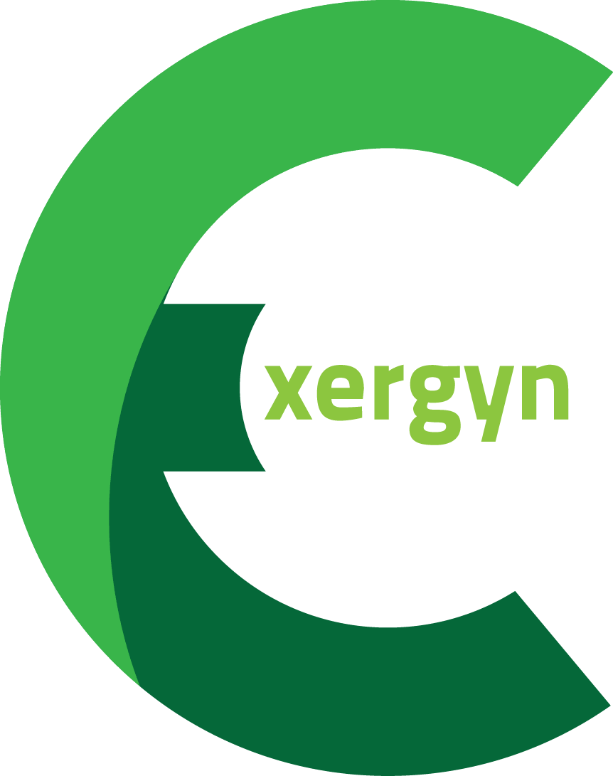


The owners of the company wanted it to show its connections with scientific principals, the idea that the engine will improve the existing engine efficiency as well as being beneficial for the planet. The infinity symbol was incorporated to help represent some of these ideas.
The capital N was used to highlight the word Exergy

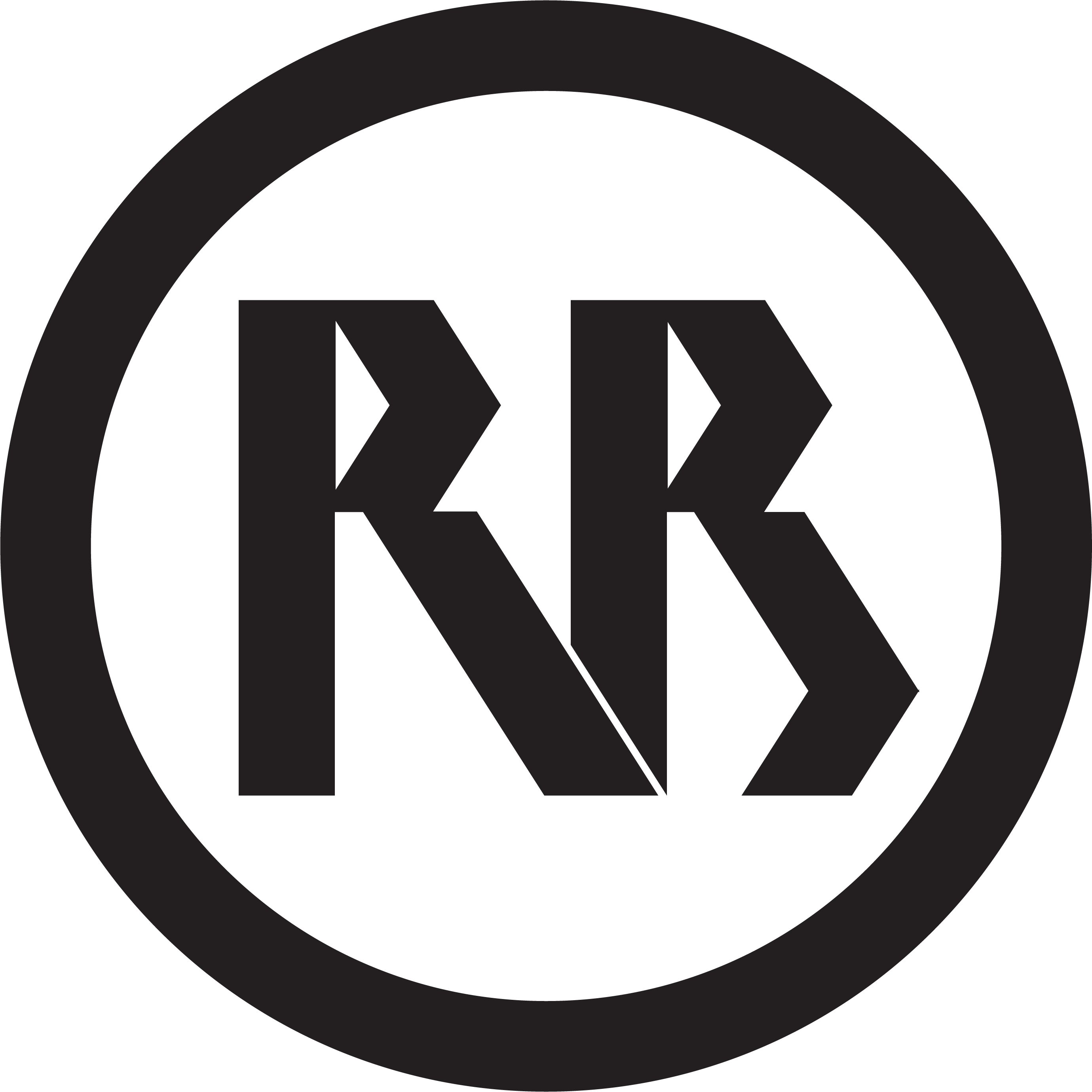
RBRK was a logo designed for a woodworking and metalworking company that myself and a friend wanted to create, the name of the company is both of our initials, we wanted a very simple logo that was easy to read and could be easily branded onto pieces of wood. By just adding a line to join the top and bottom letters a very simple logo was created that works in very two colour designs as well as a single colour with the intention of being stamped or branded on wooden products.


I decided that I should create a logo for myself to go onto my website, after playing around with a few different ideas I decided to look at some items which I had designed and one thing stood out to me, I like clean lines and angles. I decided if I was going to create a logo for myself this is the style I should go with so after trying a few different angles and various proportions I finally settles on the logo below


